Visualizing Data
Goals
This chapter covers how to create plots of tabular data using the Grammar of Graphics.
You should be able to map data variables to a variety of aesthetic codings, to know how to use different scales, and to produce charts using different encoding schemes (such as bars, circles, points, and text.)
Functions we talk about:
Fundamental to charts:
ggplot()aes
Geometries and scales:
geom_point,geom_line,geom_histogram,geom_text,geom_smooth,stat_summaryscale_y_continuous,scale_x_discrete
To make charts prettier or better constructed.
labs,coord_flip
Why Visualize?
Graphic presentation is an increasingly important element of humanities scholarship. For exploratory data analysis, visualization has long been seen as the most useful way of working with data. Patterns which can be quite difficult to describe mathematically are immediately obvious when plotted with the proper specifications.
Visualization is also an important element of scholarly communication. As scholars like John Theibault, etc. have recently argued, visualizations can themselves be an element of historical arguments.
This work is the heir to a long history of non-lexical representations of history. Graphic visualization is occasionally described as an offshoot of the sciences. In fact, the tradition is probably more closely connected to the historical and social sciences than to any of the “hard” sciences: the early history of data visualization and thematic cartography are mostly attempts to bring visual order to social and historical systems.1
The question of whether an image has “an argument” is a thorny one; the question of whether an image can provide evidence should be much less so.
The Grammar of Graphics in ggplot
In dplyr, we have already begun to learn a “grammar of data analysis.” It provides a variety of functions for describing transformations you wish to make to data; to combine them, to aggregate, to filter, and so forth. The content of those transformations is left up to the user; this is why Wickham uses the metaphor of a “generative grammar” to describe it. A grammar gives rules about construction that make it possible to describe operations much more easily than might be otherwise possible.
Historical note: this idea of a generative grammar as a live influence in general academic culture goes back to linguistics and particularly Noam Chomsky, who made his first career describing the underlying rules of language. (Chomsky, in addition to his role as a critic of modern capitalism, continues to defend his theories inside linguistics; his 2011 exchanges with Peter Norvig, the chief research scientist at Google, over the validity of the knowledge derived from machine learning techniques are well worth reading.) The insights were useful outside linguistics: the conductor Leonard Bernstein gave the Charles Eliot Norton lectures on aesthetics at Harvard in the early 1970s by applying Chomskyian techniques to musical formats.
This idea of a grammar stems from Jacques Bertin’s 1967 text The Semiology of Graphics. It was most influentially described in the statistical literature in 1999 by Leland Wilkinson in his book The Grammar of Graphics.
Data, Geometry, and Aesthetics
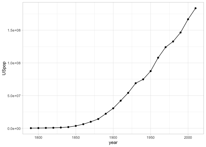
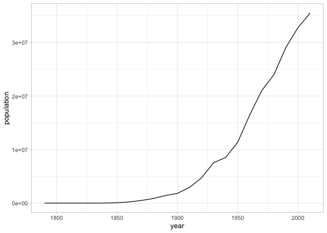
Every ggplot chart begins with a single function ggplot, which generally generally takes as an argument a single tibble. For example: if we want to plot the changing urban population of the United States, we can use functions from dplyr to collect it. Then we can create an object base_plot that contains the beginnings of the plot.
Look at the code below. It uses some of the data cleaning and tidying principles from the next section that you shouldn’t understand yet to make the dataset more easily plottable.
Then we can count by population for each year.
The next step is choose a particular way to plot the data. This is called a “geometry” in ggplot, and it corresponds roughly to the type of plot that you’ll be using. There are many different types of plots that make sense: line charts, bar charts, maps, histograms, and so forth.
As Lev Manovich says, plots work by reducing real elements to abstractions. The “aesthetic” component of a ggplot graph is the list of abstraction you want to enforce. Each particular geom will require or use certain different types of data. A line chart plots one thing on the x axis, and another on the y.
We set this in ggplot using the function aes. aes specifies the aesthetic mapping. So make a linechart of population over time, we simply tell it that y should be population, and x should be time.
For this example, we’ll make a simple line chart. This requires three elements. It would be nice if you could simply write base_plot + geom_line(), but every chart requires at least three elements.
These are combined together using the + sign. Note that you are not restricted to just one mark type per chart. In the image below, there is both a set of points and a set of lines.
Changing Scales
Scales are some of the most important elements of any chart.
In ggplot, scales are generated automatically from the aesthetic, but often you will want to tweak the settings. Your variable names may not appear right, you may not like the colors ggplot choices, or you may want to change the outline.
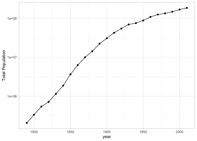
For humanities data, in most cases a logarithmic distribution fits the data better than a straightforward linear one. (Log distributions assume that rather each tick of the axis indicating an increase of a fixed amount.)
Other sorts of scales will take other options. For example, a color scale might benefit from manually specifying the colors that you’re interested in.
Conventions around X and Y axes.
For at least a hundred years, the making of charts has been surrounded by a set of pronouncements about how to make charts. People have extremely strong opinions, often not that well informed, about the right way to display information.
Some conventions you probably know intuitively. The most fundamental is that the X axis is supposed is supposed the represent the dependent variable, and the Y axis is supposed to represent the independent variable. This assumption is built into ggplot in a variety of ways. A line chart connects points along the X axis, not the Y axis; histograms automatically assign Y to be the count variable. The language of ‘dependent’/‘independent’ may be alien to humanists, so another way to the think about it is that the X axis should usually represent the more fundamental concept, while the y axis shows the thing you are counting, measuring, or describing. Time should almost always appear on the X axis. In some cases when you want to swap the two axes; this is OK, but often you will have to use coord_flip() to do so (see below).
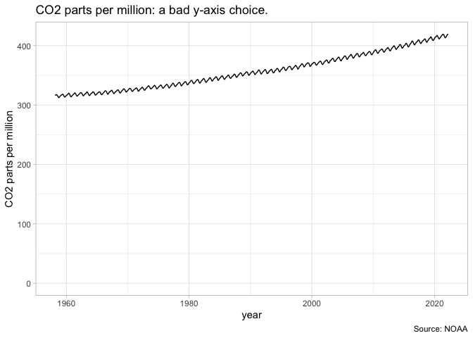
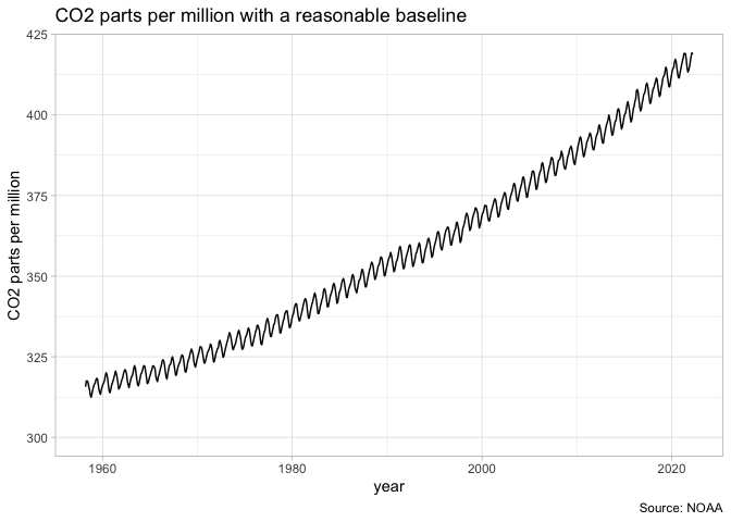
A less well-founded rule that you’re likely to encounter is the proscription that a Y-axis should always include the number zero. People who say this as an ironclad rule are wrong, but often zealous in their wrongness–there are many cases in which it is nonsensical to insist that zero is necessary. A chart of CO2 parts per million should not show zero as the baseline, because the more important baseline is the range between 180 and 300 ppm predominant in the last million years. A chart of temperature should not include zero as a baseline because the temperature 0–in Farenheit or Celsius–is generally important. A chart with a logarithmic scale cannot include zero as a baseline because to do so is mathematically impossible. And so on. It is a generally useful rule of thumb to try to include a zero baseline if creating a bar chart, but even this rule can be broken if you make appropriate note of it.
Facets
The “small multiple” is a plot strategy where different data is plotted acording to the same principles in several different plots. In ggplot, this is possible through the facet functions: facet_grid (when you have both x and y aspects to facet off of) and facet_wrap (when you only want to facet off a single thing.)
Our chart of US urban population can accomplish the same thing for each individual states by first grouping by state in the creation field, and then by faceting by state.
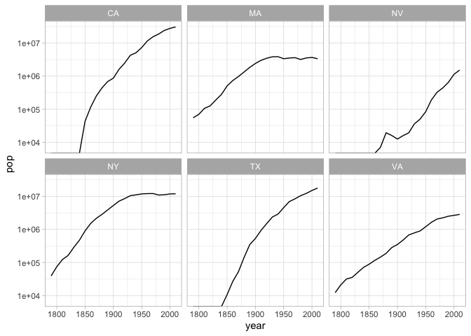
Change the code that shows population for NY, MA, NV, NY, TX, and VA to use color instead of faceting to show changes in population.
Using the rank function inside a function and facet, make a geom_text plot that ranks the top ten cities for each census. (Hint: You will need to group by year and sort)
Other settings
Coordinate systems
For the most part, you’ll probably be plotting in cartesian space–that is to say, your coordinates will look like graph paper.
Cartesian is not the only coordinate system, though. Two other particularly important ones built into ggplot are coord_polar and coord_map.
coord_polaruses polar coordinates: instead of positioning an element by x and y, it positions it by angle and distance. Some quite famous charts use it, such as Florence Nightingale’s Coxcomb charts.coord_mapallows you, with themapprojpackage, to make a wide variety of maps in R that project latitude and longitude in ways other than the standard projection system.
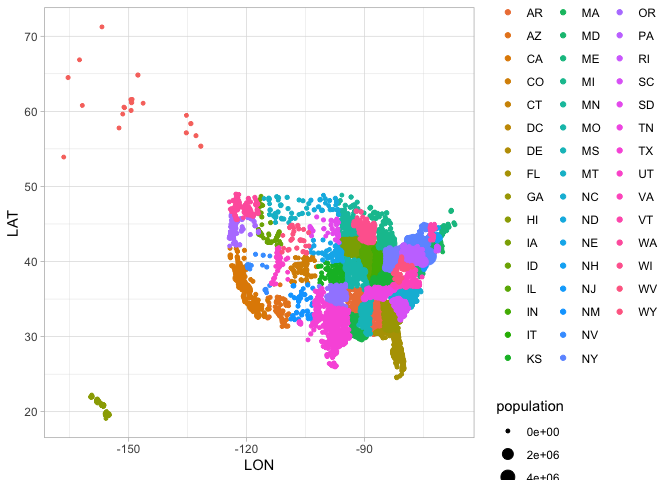
Because it will form the basis for further work, here is code to plot cities by longitude and latitude. This is not, exactly, a map: but you can see the outlines of the states.
Labels
Charts need explanations. This isn’t some minor thing; a chart that lacks any text at all is meaningless.
The labs function lets you specify those. The most common labels to put in are title, caption, and x and y. (The latter two change the label on the axis; that’s very often something that you want to do.)
Themes
You can specify the appearance of grid lines, legend position, and all sorts of other elements by adding a theme to the end. I tend to use theme_bw() when preparing something for a publication. But there are packages for many more. The BBC has their own package for graphics; theme_xkcd lets you make things that look they were hand-drawn in the style of the popular webcomic.
Exploring Data with ggplot
We’re going to explore these geoms with a cleaned version of the crews dataset.
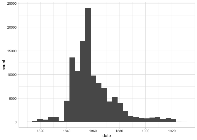
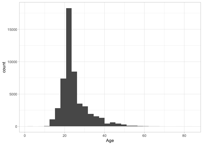
Histograms of quantitative variables
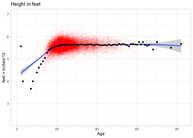
For statisticians, the most basic chart is a histogram, which shows how frequent a single variable is at different levels. We can plot the height of our sailors by adding a new layer to the plot: that consists of the function geom_col to build a histogram, and the aesthetic aes(x=height, y = n) to tell it we want a histogram about the distribution of height.
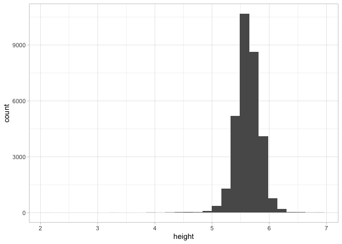
That might seem like a lot of work, but the advantage is that once a plot is created, we can simply swap out the aesthetic to plot against–say–date or age as well.
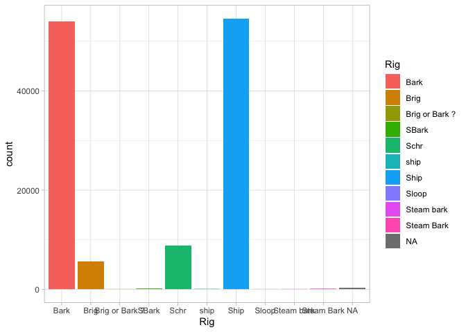
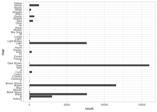
Barplots of categorical variables
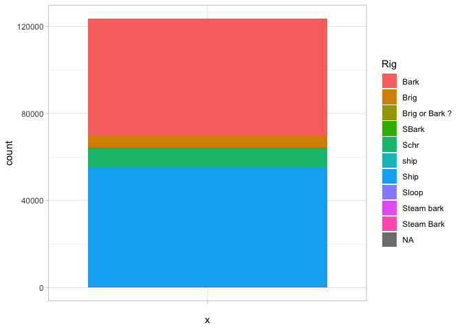
When you use a histogram with a categorical variable, you ask for a barplot, as when we look at the types of ships in the sample.
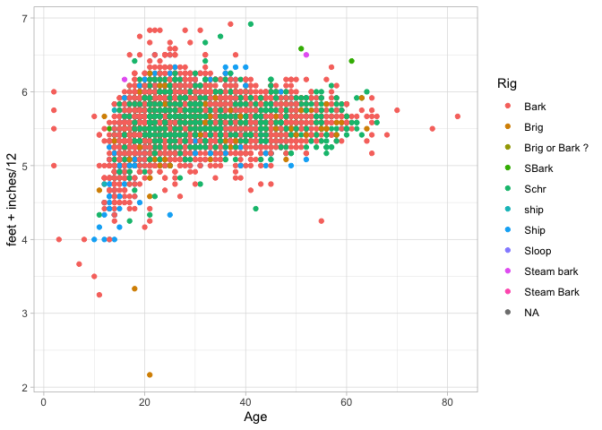
A barplot is different, though, because we might want to add some more variables in. For example, we can add another aesthetic for ‘fill’ (which gives the color of the bars):
That’s a nice chart. But we could also change it so the x-axis contains to information by just setting it to an empty string, and the bars will appear stacked on top of each other.
That’s not as good a way of visualizing the information: you have to compare the size of chunks against each other. But if we make one more tweak—setting the y axis to a polar coordinate system—suddenly it becomes very familiar.
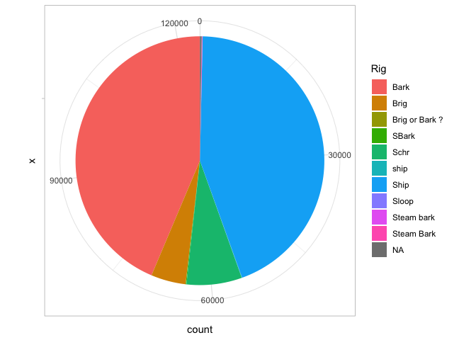
It’s a pie chart! A pie chart is the same as a bar chart except for the coordinate system! Since Edward Tufte, pie charts are universally reviled. Unlike bar charts, they are not a fundamental element in the grammar of graphics; instead, it is describing them here as “a stacked bar chart plotted in a polar coordinate system.”
Scatterplots
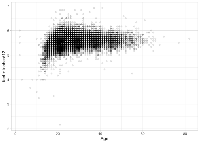
For exploratory data analysis, the scatterplot is to multivariate data what the histogram is to single-variable data.
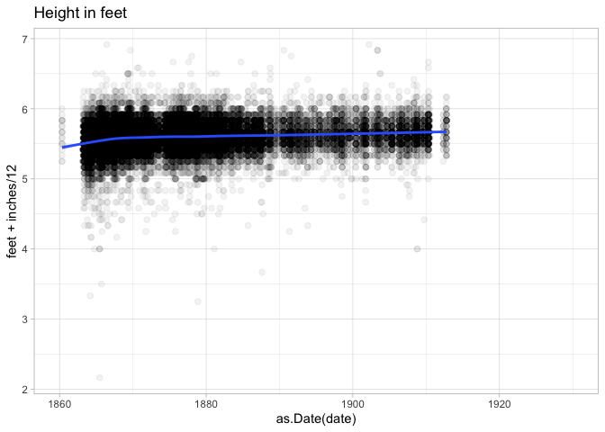
Summary stats are useful, but sometimes you want to compare two types of charts to each other. The next basic chart to use is a scatterplot: in ggplot, you can get this by using “geom_point.” Suppose, for example, we want to compare height against age.
Density Plots
Here are some survey plots on the data that we have.
Sometimes when scatterplots get too full, it is useful to bin by squares or hexagons. (Hexagons are popular because they are the roundest shape that can snap together evenly. That’s why honeybees use them to organize their hives.)
Text Scatterplots
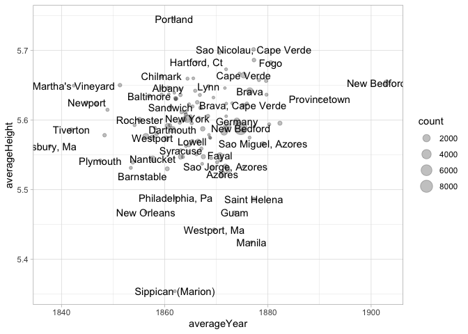
For humanities data analysis, text scatterplots are particularly important; points are often individual items we care about, not just interchangeable elements.
For them, you can use the geom_text function. It works just like geom_point, but requires an additional aesthetic: label, which maps to a character field.
What does this chart show? What variables (if any) do you think are driving this chart?
Colors
Every element of a data visualization requires as much care as every sentence in an essay. But color–if you choose to use it–is one of the most complicated things to show, because our intuitions are often wrong. The following explains the very basics of this space, but the primary takeaway should not be that you (or I!) know enough color theory to adequately choose our own colors; it’s that color defaults from even a decade ago are probably worth shying away from in favor of pre-packaged solutions.
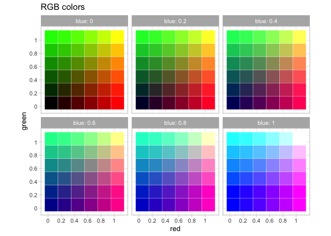
RGB
Colors in computers are usually expressed the “RGB” format of three numbers corresponding to the strength of red, green, and blue light coming through. The color “green” can be expressed either as three numbers between 0 and 1 (0, 1, 0), three numbers between 0 and 255 (0, 255, 0), or–as you often see in HTML–in hexadecimal format like #00FF00. Each of these is fundamentally the same; they mean to maximize the green channel of a visualization (the green pixels on your screen) and do nothing with the others. #00FF00 is hexadecimal notation for means 00–0 in regular numbers for red, FF (255, the highest two-digit number in hexacimal) for green, and 00 (0) for blue. If you want to tweak colors you pull from online directly, you can edit them directly.
There are also a number of conventional color names that you can use like “green”, “blue”, “red”, and “black.”

RGB colors do not work well for scales because they do match the way the human eye works. An early attempt to fix this problem are a set of related colorspaces based around “hue” with names like HSV, HCL, and HSL. They try to represent the colors of a rainbow as a three dimensional wheel, with “brightness” (“Value”) as one dimension and “saturation” as the other. ggplot’s default colorscheme, created in the late 2000s, uses this space, selected from evenly around the HCL color wheel.
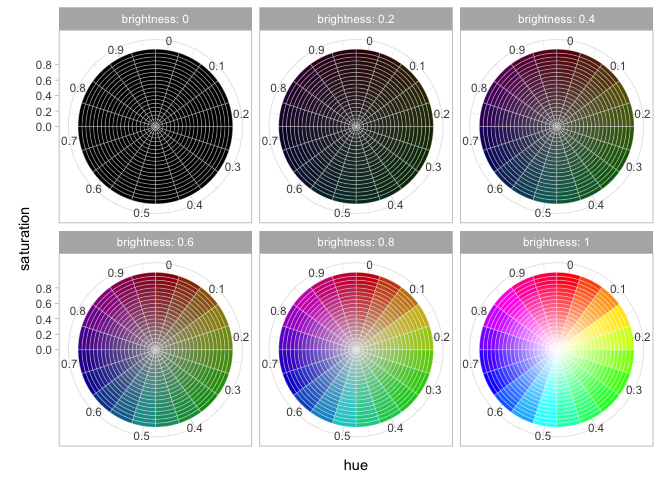
These hue-based methods are better than RGB colors but suffer many subtle problems of their own, including one big one–the fact that almost one in ten men, and about one in two hundred women, have some form of colorblindness. This means that when picking a color scheme, you cannot trust your own eyes because your eyes may not work like everyone else’s.
Instead, you should use someone else’s color schemes. One set of color schemes that sees extremely wide use are those developed by geographer Cynthia Brewer for the 2000 US census and browsable online at [colorbrewer.org]. They are built into ggplot into the functions scale_color_brewer() (for discrete values) and scale_color_distiller(). If you are trying to represent categorical values, you write scale_color_brewer(palette = "Dark2").
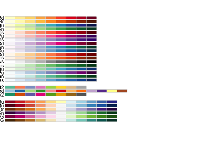
The different palettes are useful in different cases–I am partial to PuOr for diverging data when there is no qualitative difference between the fields, RdBu for plotting US political parties, and PiYG when the scale is bad to good. (Red to green is a tempting but unallowable scheme, since red-green colorblindness is very common.)
For plotting absolute quantities, three related schemes are your best bet. Viridis is a green to yellow colorscheme, magma, and inferno black to red.
A common beginner’s mistake is to use a rainbow color palette to “get more separation.” In general, color is not capable of the many things people often want it to do, and you should consider using a different encoding dimension like shape, faceting, or size instead.
Exercises: Visualizing Data
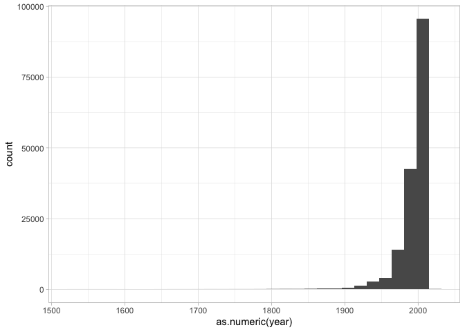
Below is something new: an assignment of a function. This is a way to create your own functions; the one below cleans our book data a bit more by turning the author’s birth and death dates, and the publication dates, into numeric values for plotting.
Function definitions are the same as any other variable definition in R, but they start with function() and the content of the function is wrapped in curly brackets ({ and }). The new variable is a function that you can use again and again; it will change its results depending on what arguments you pass in.
Here’s a plot of when books were written that uses this cleaning function.
Modify the plot that shows book years so that instead of looking at the years books are written, you’re seeing the dates in which they died.
Make a scatterplot using this data and the grammar of graphics.
It should:
- Have the x-axis represent birth year.
- Have the y-axis represent publication year.
- Use the
geom_pointfunction to make a point chart.

The code below adds a new variable to the dataset called ‘alive’ that shows if the author was still alive when the book was written. Make this into the ‘color’ variable of your scatterplot.
Now let’s look at some plots where we perform data transformations first.
Translate the following set of instructions into code:
- Clean the books set;
- Count the number of authors;
- Limit the list to the most authors;
- Draw a bar chart (
geom_col) of the counts data you have made.
- Go back to the population dataset.
Recall this code from the text that tidies the data so that each year is a population: you may need to run it yourself.
The chart below shows the combined population of California and Michigan. Make it instead show them separately, represented by either the color or lty aesthetic. (You’ll need to change the data analysis code before the ggplot function, and the plotting code after.)
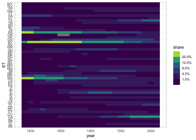
Here’s New York City’s population. I’ve added a column to the dataset that represents “total population.” Plot not New York’s population, but its share of the national urban population.
In what year was NYC the maximum share of the national urban population?
There’s something funny going on in that chart between 1880 and 1920. Can you figure out what it is? If so, make a chart that explains why the shape of the line in the previous chart isn’t to be believed.
Make a map of the United States in which each city is colorized by the year that it had its maximum population according to the census data. (Hard, very skippable.) ::: {.cell hash=‘Visualizing_Data_cache/json/unnamed-chunk-40_c0ba6801c8c585c73a768aeef64c61df’}
:::
Free exercise
At this point, you should be able to find some kind of tabular dataset that’s a little bit interesting to you. Load it in, and start to explore it through a number of plots.
In previous chapters, we’ve laid out a number of functions for you to work with data frames.
(On data frames)
filtergroup_bysummarizemutatecountarrangemutate
(Inside summary/mutate calls.)
sumnmeanstr_extract(inside mutate)str_replace(inside mutate)
Use at least 7 of these functions to create multiple different views of your dataset. Be sure to use the labs function to put a title on top of your dataset that provides some interpretation of it.