Maps as Data
The best reference on mapping in R Robin Lovelace’s free online book ‘Geocomputation with R.’ My goal here is to give a shorter, more opinionated account of mapping in R than Lovelace provides, and to show the connection between mapping and the other algorithms we’ve already discussed, especially with reference to the kind of data humanities students are likely to encounter.
Mapping is often treated as distinct from data analysis. You may have looked in other classes at geodata in a framework like ArcGIS or QGIS. These programs–geographic information systems–are indispensable for certain kinds of map making, such as tracing historic maps into present-day spaces. But one of the big shifts in the way maps are made in the past ten years has been that the stranglehold of geo-specific packages–especially those created by ESRI, such as ArcGIS–has started to fade. It turns out that regular old information systems can handle geography quite well; and so there’s a rise of interesting new paradigms for mapping in languages. These are all useful in different ways. Interactive mapping is possible through a variety of sophisticated vector tile packages in Javascript (from not just Google maps, but also the impressive new map visualization library from Uber, deck.gl) and through the D3 ecosystem, which has the best support for esoteric map projections of any language.1 Python’s Geopandas and Shapely packages give a sound route towards working with maps as data, as well.
2: D3’s support for incredibly sophisticated projections is largely due to a shortcut it takes; its projections generally treat the earth as a sphere, when in fact it is has a lumpy, distinct shape of its own, elongated in some places and squashed in others.
R has long had decent mapping packages, but the new standard is the sf (for “simple features”) package by Edzer Pebesma.[@pebesma_simple_2018]. There are other, older ways to read in data, such as the sp package, and sophisticated geographic algorithms in a variety of packages. You may find older code online doing things using sp-based approaches. I recommend staying entirely within sf, if you’re going to do maps in R ; because it allows you to treat spatial data as a table of counts in the same sensible way that we have been working with maps to this point.
What is a map as data?
The model of geographic data that dominates data-oriented mapping is the following.
- There are geographic shapes or structures; cities, roads, oceans, the path taken by a particular boat, the plantation owned by a particular slaveholder in 18th century Brazil. These are geometric; they have a shape. All geographic elements are one of three types:
- A shape. We call this a ‘polygon’ or a ‘multipolygon,’ because a single entity may be more than one piece. (Michigan, for example, has two pieces; Staten Island is part of New City, but geographically distinct.)
- A line. Some geographic items are best represented as lines.
- A point. Very few things are points in real life; but often, especially when working with data, it’s easiest to treat them as if they were. For example, the city data that we have been working with has a latitude and longitude for each city.
- There are data points that describe the things. A city might have a population; a state has a name; a street might have an average traffic density. Some datasets are quite rich already; but the art of engaging in working with map data is creating new data entry for existing things.
Representing spatial data
An sf object is basically a tidy, row-per entry data frame; each row is a single geographic entity, or feature.
There are a few differences, though:
- Each feature has a special
geometryfield, that contains spatial data. - There is some associated data that contains geospatial metadata. The most important of these is information about projections.
Converting point data
We’ve already encountered point data, so we’ll start with that.
We can do this with our city data from earlier in the semester. The key function here is st_as_sf, which takes an ordinary dataframe and turns it into an sf object. In order for that to happen, you need to tell it which columns are geographic, so that it can bind those into a new geometry feature; and a “crs” (coordinate reference system) which specifies what kind of coordinates you’re passing in. The CRS argument is required, but will almost always be 4326, which is the EPSG code to represent plain latitude and longitude. EPSG stands for “European Petroleum Survey Group;” it is a no-longer-existing (merged into the International Association of Oil & Gas Producers) industrial group that wanted to keep lists of different map projections straight.
The code below creates a spatial features frame from a set of cities
If you type cities in, you’ll see a variety of different metadata, including that this is a point set: that it has a bbox (a bounding box); and two pieces of information about the map projection. One is the “EPSG” code; the other is a ‘proj4’ string that’s another way of setting the projection. We’ll talk more about projections later in this chapter.
The rest is simply the same as our dataset, except that it now has one additional column called ‘geometry.’
      cities <- CESTA |>
  # Removes both NA values and those coded as 0.
  filter(!is.na(LAT), LAT != 0) |>
  st_as_sf(coords = c("LON", "LAT"), crs = 4326)

cities
We can plot this frame by using a new geom called geom_sf. Note that we no longer need to include ‘x’ and ‘y’: the coordinate system takes care of that for us.
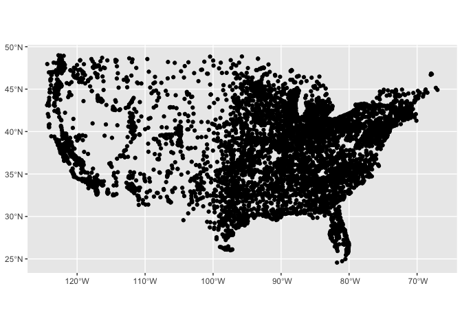
      cities |> filter(ST != "AK", ST!="HI") |>
ggplot() + geom_sf()
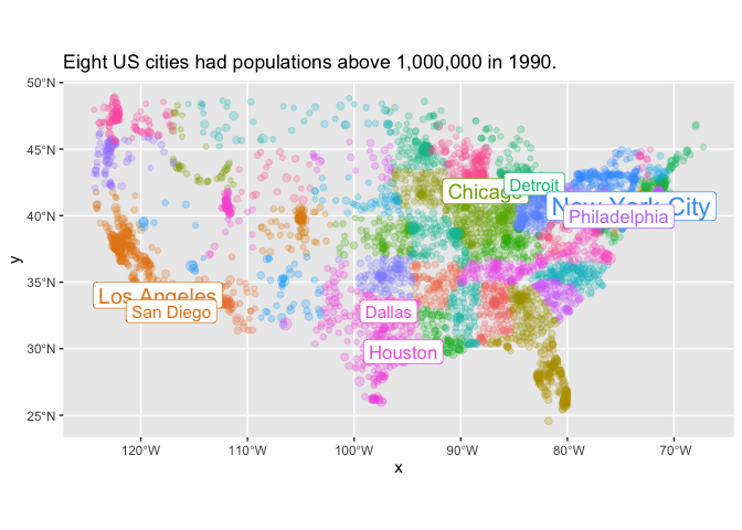
Any of the other aesthetics we know from ggplot2 can be applied. size changes the size of points; fill changes their colors; and the use of geom_sf_label makes it possible to add a set of labels on top of a chart.
Note an additional ggplot trick here for plotting multiple datasets at the same time. Inside geom_sf_label, we use a different dataset: cities |> filter(1990> 1000000). Without that parameter, we would be trying to label all the cities in the dataset.
With mapping in R, it is frequently very useful to plot multiple items on top of each other. You’ll see this same pattern again and again in this notebook.
      cities |>
  filter(ST != "AK", ST!="HI", `1980` > 0, `1990` > 0) |>
  ggplot() +
  geom_sf(alpha = 0.25) +
  geom_sf_label(data = cities |> filter(`1990` > 1000000)) +
  aes(size = `1990`, color=ST, label = City) +
  theme(legend.position="none") +
  scale_size_continuous(trans='sqrt') +
  labs(title="Eight US cities had populations above 1,000,000 in 1990.")
Working with SF Objects.
Reading shapefiles.
There are several different ways to make an sf object. One is to just read in any shapefile, geojson, or other spatial object using the read_sf function. This is essentially the same as the read_csv functions with which you’re already familiar.
(One niggling note: you might find old code online that uses st_read instead of read_sf. This is less likely to work with tidyverse packages, and so you should always use read_sf.)
      us_states_file_location = system.file("extdata/states/cb_2018_us_state_20m.shp", package="HumanitiesDataAnalysis")
states = read_sf(us_states_file_location)
ggplot(states) + geom_sf()
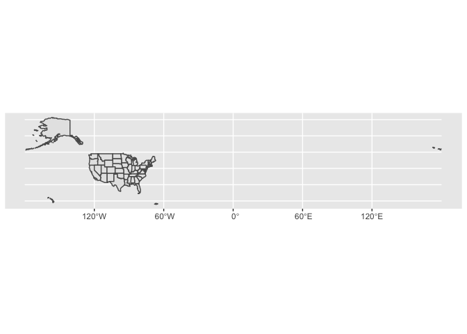
Why coordinate systems have to be such a pain.
This map is ugly, because it includes the entire globe just to accomodate a few islands in the Aleutians. It also doesn’t–or shouldn’t–look right, because the coordinates used here (latitude and longitude) distort the shape of the world.
The solution to this to use two related things; a coordinate system and a map projection. In sf, both of these are represented in the same way–by shaping the coordinates used for you data. These coordinates are the hardest part about digital mapping. Whether in R, ArcGIS, or web mapping, coordinate systems can be intensely confusing to beginners. So let me explain briefly why there are so many coordinate and reference systems, and why you should be happy to switch among them.
Coordinate systems exist for two reasons. One has to do with storing information; the other has to do with displaying it. You probably know why you need a map projection. The earth is round, and so any possible image we show necessarily distorts the shape of that globe to flatten it out.
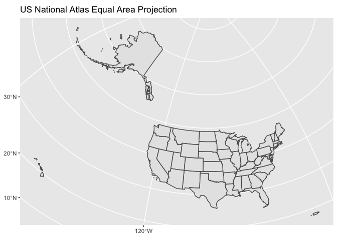
Every place in the world will have a different appropriate projection. In general, the way to find one is to use either Google or [https://epsg.io] to search for “EPSG code for mapping XXX”. Mapping all fifty states and Puerto Rico is relatively rare, but you might want to try one from the US National Atlas, probably its Equal Area projection. That can be specified as crs = 2163.
states |> ggplot() + geom_sf() + coord_sf(crs = 2163) + labs(title = "US National Atlas Equal Area Projection")
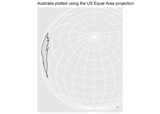
These projections have to be chosen carefully, because they are specifically fitted for particular areas. If you try to plot Australia using a US projection, it looks absurd.
      rnaturalearthdata::countries50 |>
  st_as_sf() |>
  filter(sovereignt |> str_detect("Australia")) |>
  ggplot() + geom_sf() + coord_sf(crs = 2163) +
  labs(title="Australia plotted using the US Equal Area projection.")
There is no general purpose one-size-fits-all projection.The Mercator projection, which is still often used for large scale mapping, looks–hopefully–ridiculous. Although Alaska is the largest state, it is not as large as half the country put together.
states |> ggplot() + geom_sf() + coord_sf(crs = 3832) + labs(title = "Mercator Projection")
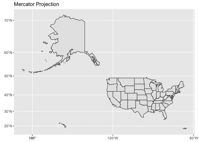
Part of creating compelling digital maps is choosing an appropriate projection. At large scales (i.e., small areas plotted–the size of a city) the Mercator projection is usually fine–companies like Google and Apple use it for their online maps because it preserves the shapes of buildings and aerial photography almost perfectly.
Choosing projections.
If you are plotting either the whole world, or some relatively obscure part of it, though, you may need to make a decision. Since the Earth is (almost) a sphere, any flat projection will bring some kind of distortion. The choice of map projection is about meeting two incompatible goals. When you wade through options, consider the tradeoffs you make on the following fronts:
Preserving area. A projection that preserves area is called an ‘equal area’ projection. A good choice at the global scale is the ‘Mollweide’ projection; for national mapping of large countries (like Russia, the US, or China) an Albers projection is best. At the local scale, such as a single city, area distortions are unlikely to be important and you can focus on the other goal:
Preserving shape. A projection that preserves local shapes is called a ‘conformal’ projection. At the global scale, the Mercator projection is widely used. (Too many well-educated people know only one thing about about map projections; that the Mercator projection is distortionary and therefore bad.) For regional mapping, the Lambert conformal cylindrical projection is frequently deployed in regions far from the equator; closer to the equator, the Mercator projection is fine. For geographic entities that extend mostly north-south (like Chile or California) a transverse Mercator projection works better than the traditional Mercator.
We need multiple ways to store information.
This explains why we need to choose a coordinate system for plotting. But one of the things that most perplexes newcomers to digital mapping is that
In a minute, we will talk about spatial joins. But the most basic join between our two sets fails, if you try to run it, because they are in different coordinate systems before being plotted.
cities |> st_join(states)
This causes no end of trouble for beginners to mapping. Why not just store everything as longitude and latitude, and only worry about projections when it’s time to actually draw a map? Coordinate systems are a pain because the earth is not an even cartesian plane. There is no way around this. And it matters not just for plotting, but for storing data. There are three reasons.
To think about this, imagine that we are drawing not all of America but just–say–a map of Washington Square Park in New York City, including pathways, underground sewage, benches, etc. Longitude and latitude would fail for three reasons:
- The numbers would get absurdly small; a bench might be 0.0005 degrees of longitude long.
- The earth is not a sphere; in fact, it is a slightly lumpy ball of rock. A circle drawn around the equator is longer than one drawn around the two poles; and different parts of the earth are slightly higher or lower than others. The overall shape of the earth is known as the ‘geoid’; but since this is an ongoign project of measurement, most projections assume a somewhat simplified shape that will be more appropriate in some parts of the world than others.
- The continents themselves are not fixed in location. Australia is moving at 7cm a year; if you were to precisely map the locations of a park in Sydney, in twenty years all the locations would be off by over a meter. That might not matter for a web map, but it could be disastrous for an archeological dig.
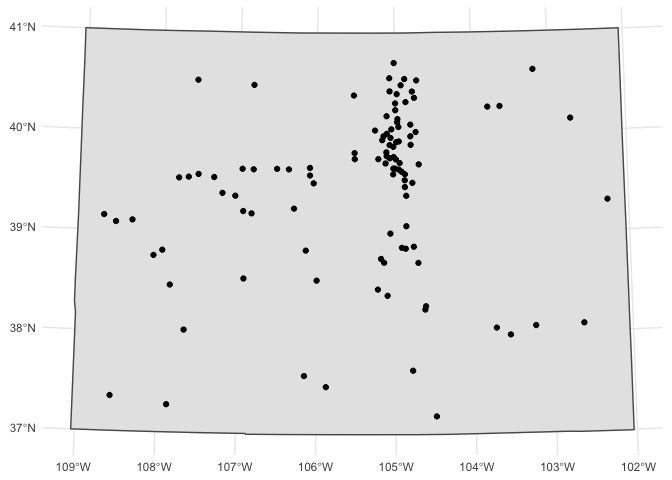
For all these reasons, most local data uses a local projection city. New York City, for example, generally uses a version of the New York State Plane. The same holds for most other regions. There are two important ways to define a projection. One is as a number; this refers to a list of “EPSG” codes. You’ll generally come across them if you search the Internet. If you search, say, for “EPSG Colorado map projection,” it will lead you to the page for EPSG:26954; pasting this number in will then give you a good projection for Colorado that captures how the state is narrower at the top than the bottom even though i’s ostensibly a square.
      cities |>
  filter(ST=="CO") |>
  st_transform(crs = 26954) |>
  ggplot() +
  geom_sf(data = states |> filter(STUSPS == "CO") |> st_transform(crs=26954)) +
  geom_sf() + theme_minimal()# + geom_sf_label(aes(label = City))
Loading data through R packages and choosing world-scale projections
Finally, a number of common shapes are available directly in R without downloading through the rnaturalearth package.
      library(rnaturalearth)
countries <- ne_countries(scale = "medium", returnclass = "sf")
Data manipulation
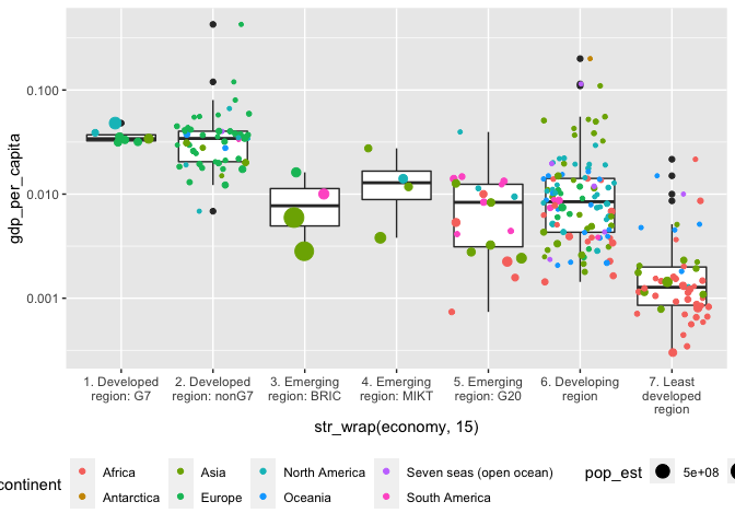
You can treat sf objects just like dataframes for most purposes; for instance, you can mutate countries to create a field for per-capita GDP and then make a boxplot to understand the categories it uses. This is not a map, though it’s made from map data. This is worth remembering–too often, people insist of visualizing geographic data as maps when another form would do better.
      countries |>
  mutate(gdp_per_capita = gdp_md_est / pop_est) |>
  ggplot() + aes(x = str_wrap(economy, 15), y = gdp_per_capita) + geom_boxplot() + scale_y_log10() +
  geom_point(aes(size = pop_est, color = continent), position = position_jitter()) +
  theme(legend.position = "bottom")
Cartography
But you can also view sf features as a map. The easiest way to do this is by using the geom_sf function in ggplot. Just as geom_point adds a point, geom_sf adds any spatial element to a chart.
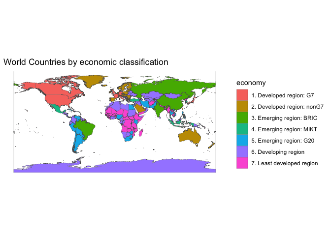
      countries |>
 # st_transform(crs = "+proj=moll") |>
  ggplot() +
  geom_sf(aes(fill = economy), lwd=0.1) +
  theme_minimal() +
  labs(title="World Countries by economic classification")
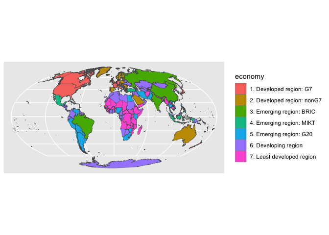
To change the color of an object, use st_transform with the crs that you want. A Mollweide projection can be created using a proj4string that simply says moll; it’s often a decent choice for mapping the globe if you wish to preserve equal area.
      #make_background = function(crs) {st_graticule(ndiscr = 1000, margin = 10e-5) |>
#  st_transform(crs = crs) |>
#  st_convex_hull() |>
#  summarise(geometry = st_union(geometry))
#}
rnaturalearthdata::sovereignty50 |>
  st_as_sf() |>
  st_transform(crs = "+proj=moll") |>
  ggplot() +
  geom_sf(aes(fill = economy), lwd=.15)
Spatial joins and mapping counts and data
To explore some of the ways that more complicated maps might work, we’ll look more at the Pleiades dataset and the types of places that exist in the Roman empire.
This requires some preliminary work. First, we need a shared map projection appropriate for plotting the Roman empire. Here we’ll use an equidistant project centered on Rome. The string below is called a proj4string; it is another formal language for describing a special type of data. Like arithmetic or regular expressions, it has nothing to do with R; it and another standard called “well-known text” are the two major ways to describe map projections.
In general you probably don’t want to create your own map projections, but the language for doing so is robust enough that you can! Here, for example, I simply took an existing crs defining an equidistant projection and moved it so that the center of the map was Rome.
      crs <- "+proj=aeqd +lat_0=41.9 +lon_0=12.5 +x_0=0 +y_0=0 +ellps=WGS84 +datum=WGS84 +units=m"

EUproject = function(data) data |> st_transform(crs = crs)
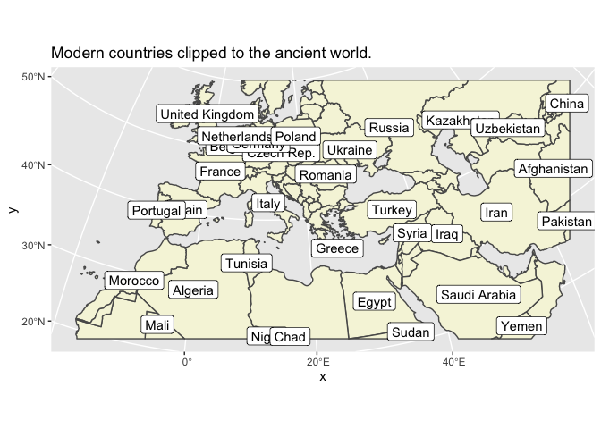
Second, we want to create something called a ‘bounding box.’ This is so that we can have the shape of the world behind our maps. We’ll build one that includes all the countries inside a box defined by five countries on the edges of the Roman empire.
      bbox <- countries |> filter(admin %in%
  c("Ireland", "Iran", "Egypt", "Morocco", "Estonia")) |>
  EUproject() |> st_bbox()

ancient <- countries |> EUproject() |> st_crop(bbox)
      ggplot(ancient) +
  geom_sf(fill='beige') +
  geom_sf_label(data = ancient |> filter(pop_est > 10000000), aes(label = name)) +
  labs(title = "Modern countries clipped to the ancient world.")
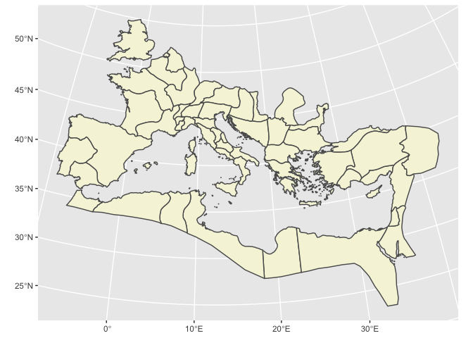
In addition to using a standard grid, you can also fit points inside any polygon you get from another shapefile.
For the Roman empire, that would mean Roman provinces. Finding data is generally as easy as searching for “shapefile” or “geojson” (the two most widely used formats for sharing map data.) I quickly turned up this map of the Roman Empire
      provinces_file = system.file("extdata/provinces.geojson.txt", package = "HumanitiesDataAnalysis")

provinces <- read_sf(provinces_file) |> EUproject()

for (fname in c("locations", "places", "names")) {
  dest = paste0(fname, ".parquet")
  if (!file.exists(dest)) {
    download.file(paste0("https://benschmidt.org/files/parquet/pleiades_", fname, ".parquet"), dest)
  }
}
pleiades = arrow::read_parquet("places.parquet") |>
  filter(!is.na(reprLong), !is.na(reprLat)) |>
  st_as_sf(coords = c("reprLong", "reprLat"), crs = 4326) |>
  EUproject()

provinces |>
  ggplot() + geom_sf(fill='beige')
Spatial Summaries
Most of the tidyverse functions we use will continue to work on spatial objects. For instance, a summary can still be used to get the counts by time period. But summary has an additional action that it performs on geometries.
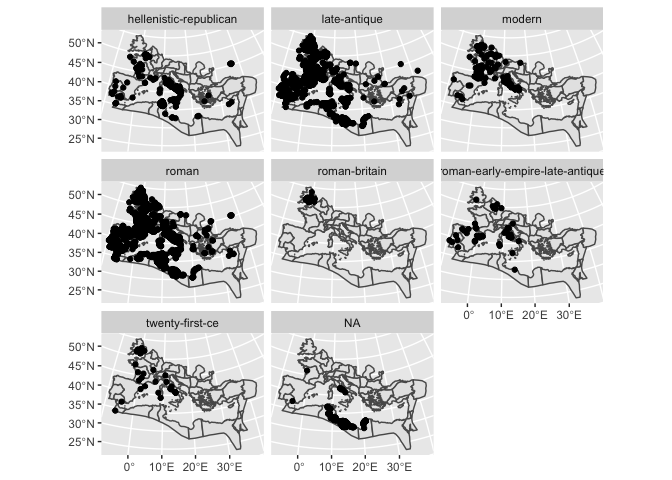
Here’s an example. If we extract villas from the Pleiades dataset, we haveover 2000 points; but if we summarize by time period, we can take just the first 8 items. But if we plot it, we can see that each of these 8 features has dozens or hundreds of individual points inside of it. This can be extraordinarily powerful.
      villas = pleiades |> collect() |>
 unnest(featureTypes) |> filter(featureTypes == "villa")
villas |> select(featureTypes)
      villa_counts = villas |>
  unnest(timePeriodsKeys) |>
  group_by(timePeriodsKeys) |>
  summarize(count = n()) |>
  arrange(desc(count)) |> head(8)

villa_counts |> ggplot() + geom_sf(data=provinces) + geom_sf() + facet_wrap(~timePeriodsKeys)
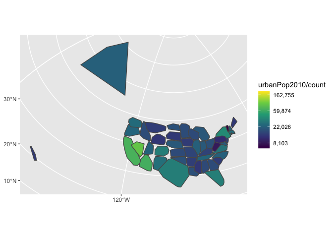
By using additional transformations, this can create different types of features. For example, the function st_convex_hull draws a line around all the entries in a point: if we do that on our collections of cities, we get blobs that approximate the shapes of the states. This can be useful if you’re working with data that doesn’t have a defined geometry.
      cities |> group_by(ST) |>
  summarize(count = n(), urbanPop2010 = sum(`2010`)) |>
  st_transform(crs = 2163) |>
  st_convex_hull() |> ggplot() + geom_sf() +
  aes(fill = urbanPop2010/count) +
  scale_fill_viridis_c(trans="log", labels = scales::comma)
Spatial joins
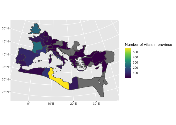
In some historical cases, the outlines may be all that you have. But in general, spatial joins allow a better way to plot areas than janky estimates like the one above.
Suppose we want to plot the number of villas in each province. This requires locating each point inside a polygon. A spatial join takes two sf features and links them when they share the same space.
By default, two items are linked if they intersect; but you can also use a variety of other functions, including requiring that all the points in one object be within those on the right, that they contain, that they be within a certain distance, and so forth. (See ?st_join for a full list.) If, for instance, you wanted to find all villas within 10 miles of a Roman road, you would use villas |> st_join(roads, st_is_within_distance, unit).
Two poihts are important to keep in mind when doing a join:
The geometries returned will be from the left side of the join. So if you have a set of points from Pleiades and set of provinces, a join which starts with the points will return more points; a join that starts with the provinces will return more provinces.
An
st_joinoperation can create many duplicate points, so it is best to do any counting operations before performing the join. For the most part in this text we ignore these issues of computational complexity; but shapefiles can be quite elaborate. Sometimes this means that you’ll actually want to do two joins.
      villas = pleiades |>
  unnest(featureTypes) |>
  filter(featureTypes |> str_detect("villa")) |>
  st_join(provinces) |>
  count(name, name = "Number of villas")

provinces |> st_join(villas) |>
  ggplot() + geom_sf(aes(fill=`Number of villas`)) +
  scale_fill_viridis_c("Number of villas in province")
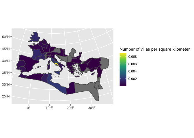
There are also some functions that can be used inside a mutate call. One is st_area, which calculates the area of a region. For villas, it probably makes more sense to plot in terms of ‘villas per square kilometer’; the following code shows that happening.
      provinces |>
  st_join(villas) |>
  mutate(area = st_area(geometry)) |>
  # as.numeric(area) is necessary to avoid an error
  # since area is cast as 'units', not number.
  ggplot() + geom_sf() + aes(fill = `Number of villas` / as.numeric(area) * 1e06) +
  scale_fill_viridis_c("Number of villas per square kilometer")
Using text analysis tools with maps
The similarities between geography and text are not just superficial; any of the tools we’ve used to look at texts can also be translated into methods for understanding geographies. We focused in the last chapters on a model that uses group_by to create “documents”; but really, things like pointwise mutual information and Dunning Log-likelihood are appropriate not just for documents in words, but for any case where you have counts inside another element.
As an example, let’s build up an extended analogy.
In this, we will pretend that geographical areas are documents and point types are words.
Using a spatial join, and an unnest call on the features, we can build a count of the most common archeological feature types in each area. As a data structure, this is the same kind of thing as a list of the most common words by document.
      types = pleiades |>
  unnest(featureTypes) |>
  st_join(provinces) |>
  filter(!is.na(name))

types_by_province = types |>
  count(name, featureTypes) |>
  arrange(-n) |>
  group_by(name)

types_by_province |>
  head(5)
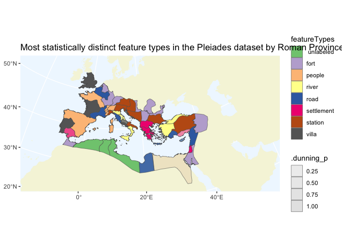
Once we’ve done that, we can perform summaries on it. For example, we can use Dunning log likelihood to calculate the most statistically distinguishing features types in each province. (This is the same, mathematically, as finding the most distinguishing words for each document.)
      top_9_counts = pleiades |> unnest(featureTypes) |> count(featureTypes) |>
  arrange(-n) |> head(9) |>
  st_set_geometry(NULL) |> select(featureTypes)

llrs = types_by_province |>
  group_by(name) |>
  summarize_llr(featureTypes, count = n) |>
  # Drop the spatial elements; we just need the names now.
  st_set_geometry(NULL) |>
  group_by(name) |>
  arrange(-.dunning_llr) |>
  inner_join(top_9_counts) |> # inner_join as filter
  filter(featureTypes != "unknown") |>
  slice(1)
      provinces |>
  inner_join(llrs) |>
  ggplot() +
  geom_sf(data = ancient |> summarize(shape = 1), fill = "beige", color = "#00000000") +
  theme(panel.background = element_rect(fill = "aliceblue")) +
  geom_sf(lwd = 0.2,   aes(fill = featureTypes, alpha = .dunning_p)) +
  scale_fill_brewer(type='qual') +
  coord_sf(expand = FALSE) +
  labs(title = "Most statistically distinct feature types in the Pleiades dataset by Roman Province")
Grid plotting
One last, advanced geo-computation element worth considering is using not previously existing shapefiles, but instead creating your own using a grid. If you want, for example, to see how many total points there are, you can bin them into a spatial grid before plotting, by first creating a grid using st_make_grid on a bounding box derived from your data.
      bbox <- countries |> filter(admin %in%
  c("Ireland", "Iran", "Egypt", "Morocco", "Estonia")) |>
  EUproject() |> st_bbox()

grid <- st_make_grid(bbox |> st_as_sfc(), n = c(60, 60), square = FALSE) |> st_sf() |> mutate(grid_id = 1:n())

counts = pleiades |>
  st_join(grid) |>
  as_tibble() |>
  select(-geometry) |>
  group_by(grid_id) |>
  summarize(points = n())

grid |>
  inner_join(counts) |>
  filter(points > 20) |>
  ggplot() +
  scale_fill_viridis_c(trans = "log") +
  geom_sf(data = ancient |> summarize(shape = 1), fill = "brown", color = "#00000000") +
  theme(panel.background = element_rect(fill = "aliceblue")) + geom_sf(aes(fill = points)) + coord_sf(expand = FALSE) +
  labs(title = "Count")
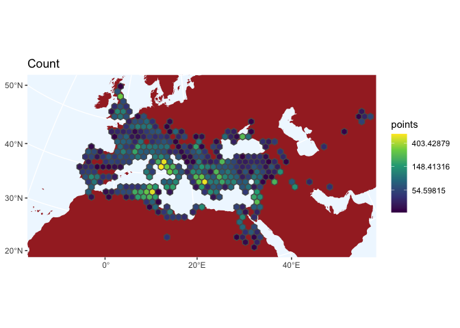
Looking at the pure counts tells us something. I would not have known ahead of time that the area around Carthage is as heavily represented as around Rome or Athens. But we can use these as documents instead, as well.
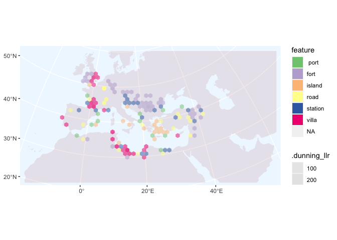
      types |>
  unnest(featureTypes) |>
  st_join(grid) |>
  count(grid_id, featureTypes) |>
  arrange(-n) |>
  group_by(grid_id) |>
  filter(!featureTypes %in% c("labeled feature", " settlement-modern", " unlabeled", "unknown")) -> counts

tops = counts |>
  summarize_llr(featureTypes, count = n) |>
  group_by(grid_id) |>
  filter(.dunning_llr > .05) |>
  arrange(-.dunning_llr) |>
  slice(1) |>
  ungroup() |>
  arrange(-.dunning_llr) |>
  ungroup() |>
  mutate(feature = fct_lump(featureTypes, 7)) |>
  filter(!feature %in% c("Other", "people"))

st_join(grid, tops) |>
  ggplot() + scale_fill_brewer(type = "qual") +
  geom_sf(data = ancient |> summarize(shape = 1), fill = "brown", alpha = .1, color = "#00000000") +
  theme(panel.background = element_rect(fill = "aliceblue")) +
  geom_sf(aes(fill = feature, alpha = .dunning_llr), color = "#00000000") + coord_sf(expand = FALSE) + scale_alpha_continuous(range = c(.5, 1))
- Use the rnaturalearthdata package to make a plot of South America by GDP. This will involve filtering, choosing a projection, etc.
      rnaturalearthdata::countries110 |>
  st_as_sf() |>
  ggplot() + geom_sf(aes(fill=type))
Free Exercise
Download two different shapefiles of the same area (New York City always works well for this.)
Do a Spatial Join between the two sets.